CONCEPT DESIGN • MOBILE UI/UX

Sikad — Optimized navigation for cyclists

Sikad — Optimized navigation for cyclists

Three mobile screens show a cycling app with route planning, live turn-by-turn navigation, and a completed ride summary with distance, speed, and calories.

OVERVIEW

Sikad (course project) is a mobile app concept designed to help cyclists navigate efficiently and discover safer, cyclist-friendly routes. It addresses key pain points in urban cycling by providing better route planning, real-time navigation, and insights tailored to riders' needs.

TIMELINE

Jan - Mar 2023

ROLE

UI/UX Designer

TOOLS

Figma, Photoshop

CONTEXT

Understanding cyclist behavior

I conducted a brief interview with a local cyclist to explore their pain points with existing navigation apps. I also analyzed discussions in online cycling communities and reviewed existing solutions to understand common challenges. Some insights from the research:

I conducted a brief interview with a local cyclist to explore their pain points with existing navigation apps. I also analyzed discussions in online cycling communities and reviewed existing solutions to understand common challenges. Some insights from the research:

Route obstacles

Existing navigation apps direct cyclists to tollways and highways where bikes are prohibited, or through remote areas with poor road conditions. The lack of dedicated bike infrastructure means cyclists must constantly assess safety on the fly.

Adaptive behavior

Unlike drivers, cyclists don't follow fixed routes. Plans frequently change based on weather, energy levels, or road conditions, requiring flexible navigation solutions.

Information needs

Cyclists want detailed route information beyond just distance and duration—specifically road surface quality, weather conditions, and stress factors that affect ride decisions.

Underlying motivation

Many cyclists ride for mental health and wellness, using it as a way to unwind and accomplish tasks, which means route experience matters as much as efficiency.

Despite growing cycling adoption, Filipino cyclists face persistent barriers:

Despite growing cycling adoption, Filipino cyclists face persistent barriers:

  • Lack of proper infrastructure – Limited bike lanes and unsafe roads force cyclists onto infrastructure designed for motor vehicles.

  • Inefficient route planning – Most navigation tools are optimized for cars. When adapted for cyclists, they prioritize speed while overlooking critical factors like road stress, visibility, and rider confidence.

THE PROBLEM

The cyclist navigation gap

The research revealed that cyclists need more than just turn-by-turn directions. They need navigation that understands their safety concerns, information needs, and flexible riding behavior. This shaped the core question:

The research revealed that cyclists need more than just turn-by-turn directions. They need navigation that understands their safety concerns, information needs, and flexible riding behavior. This shaped the core question:

HOW MIGHT WE

…help cyclists navigate safely and confidently by providing route information that matches how they actually ride?

Different cyclists, shared frustrations

While cyclists have varying experience levels and riding goals, they all struggle with the same navigation inadequacies. To better understand how to design for this range of needs, I mapped out three user types:

While cyclists have varying experience levels and riding goals, they all struggle with the same navigation inadequacies. To better understand how to design for this range of needs, I mapped out three user types:

Image 1: Cyclist in Specialized jersey with sunglasses and helmet outdoors.

Christian, 20

Student who cycles for commuting and recreation

  • Goal: Navigate urban and rural areas effectively

  • Current behavior: Cycles to school; takes long rides with friends

  • Frustration: Routes that aren't cyclist-friendly

Cyclist in black shirt with helmet on mountain road.

Jackie, 27

New cyclist exploring nearby areas

  • Goal: Go on beginner-friendly routes to scenic views and destinations

  • Current behavior: Takes photos of scenic destinations

  • Frustration: Encountering challenging routes when starting out

Cyclist in blue jersey with sunglasses and helmet.

Danny, 46

Experienced cyclist focused on fitness

  • Goal: Record and monitor regular cycling sessions

  • Current behavior: Doesn't meticulously plan beforehand

  • Frustration: Getting lost in remote areas

Christian, 20

Student who cycles for commuting and recreation

  • Goal: Navigate urban and rural areas effectively

  • Current behavior: Cycles to school; takes long rides with friends

  • Frustration: Routes that aren't cyclist-friendly

Jackie, 27

New cyclist exploring nearby areas

  • Goal: Go on beginner-friendly routes to scenic views and destinations

  • Current behavior: Takes photos of scenic destinations

  • Frustration: Encountering challenging routes when starting out

Danny, 46

Experienced cyclist focused on fitness

  • Goal: Record and monitor regular cycling sessions

  • Current behavior: Doesn't meticulously plan beforehand

  • Frustration: Getting lost in remote areas

DESIGN APPROACH

Translating research into product direction

Based on the user research and a competitive analysis of cycling apps (Strava, Komoot) and navigation tools (Waze), I identified three key directions that would address the core pain points cyclists face:

  • Easy-to-use navigation – An intuitive map for effortless route search and navigation, addressing the frustration cyclists have with car-centric tools that send them down unsafe routes.

  • Community insights – A crowdsourced system for real-time route updates, recognizing that cyclists rely heavily on local knowledge and shared experience to navigate safely.

  • Personalized experience – Features that adapt to different cycling styles and needs, acknowledging that a student commuter and fitness enthusiast have different priorities when planning routes.

This structure emerged from the insight that cyclists need both planning tools (routes) and spontaneous navigation (map), while community features provide the crowdsourced safety information that existing apps lack. To build the structure for the app, I created an information architecture with four main navigation: map, routes, community, and profile

User flow diagram for cycling app showing navigation from login/signup through four main sections: Map (with route search and recording), Routes (exploration and recommendations), Community (following and events), and Profile (performance and settings).

Focusing on navigation

For this project, I chose to focus specifically on the navigation experience—the core interaction where cyclists search for, plan, and follow a route. This was the most critical flow to address since it directly tackles the main pain point from research

I created a user flow that walks through a cyclist planning and navigating a route, identifying key decision points like choosing between route options, customizing preferences, and responding to real-time navigation prompts.

Detailed user flow diagram for cycling app showing route planning and navigation process from location permission through map interaction, route selection, ride tracking with pause/reject/stop options, and ride summary endpoints

Establishing the visual identity

Before diving into interface design, I created a basic brand identity for Sikad to establish a cohesive visual direction. This included the logo, color palette, and typography that would carry through the entire app experience.

Design system documentation for SIKAD cycling app showing logo variants, color palette, typography, and UI components

From concept to interface

Through sketches, wireframes, and iterations, I refined the interface with one main goal: maximize the map view and minimize distractions. One of my main goals here was to maximize the map view and minimize distractions.

Lo-fi wireframe sketch of cycling navigation screen showing route path and bottom navigation.
Mid-fidelity navigation screen showing turn-by-turn directions on Cornelia Street with speed, distance, and time metrics.
Animated high-fidelity navigation interface displaying real-time route guidance with speed, distance, and location tracking

THE OUTCOME

A cyclist-first navigation experience

The final prototype demonstrates one possible direction for cyclist-focused navigation

Animated login screen showing user authentication process with email and password entry.
Animated onboarding screens showing user selecting cycling preferences and lifestyle goal

Login / Sign up / Onboarding

Login / Sign up / Onboarding

Find a route

Cyclists can simply search for their destination and choose among the different types of routes available.

Save a selected route

After selecting a desired route, cyclists may opt to save the route for later.

Navigate with ease

Conversely, cyclists may start navigating their chosen route. After which, they can save the ride.

KEY TAKEAWAYS

Rethinking what navigation means for cyclists

  1. Cyclists need more than just routes—they need context.
    A map alone isn’t enough. Factors like road safety, incline difficulty, and bike-friendliness influence whether a route is actually usable.

  2. Design should anticipate hesitation.
    Some riders, especially beginners, hesitate to explore new routes due to uncertainty. Features like real rider reviews, estimated effort levels, and checkpoints can help build confidence.

  3. Efficiency and enjoyment aren’t always the same.
    Not all riders prioritize speed—some may prefer scenic or less crowded paths. Offering route options beyond just "fastest" could enhance the overall experience.

Mockups of a courier delivery app illustrating package selection, delivery scheduling with pricing, and a final order confirmation screen with QR code and tracking details

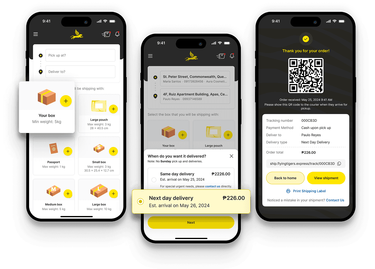
Flying Tigers Express — Revamped booking platform for interisland delivery

Mobile-First • Service Design

Redesigned the end-to-end logistics experience, from customer booking to rider operations, streamlining workflows and reducing booking friction, resulting in a 200% increase in deliveries within three months of launch.

Mobile app mockups illustrating the flow of reporting a cracked sidewalk, viewing it in a community feed, and receiving a confirmation that the report was submitted.

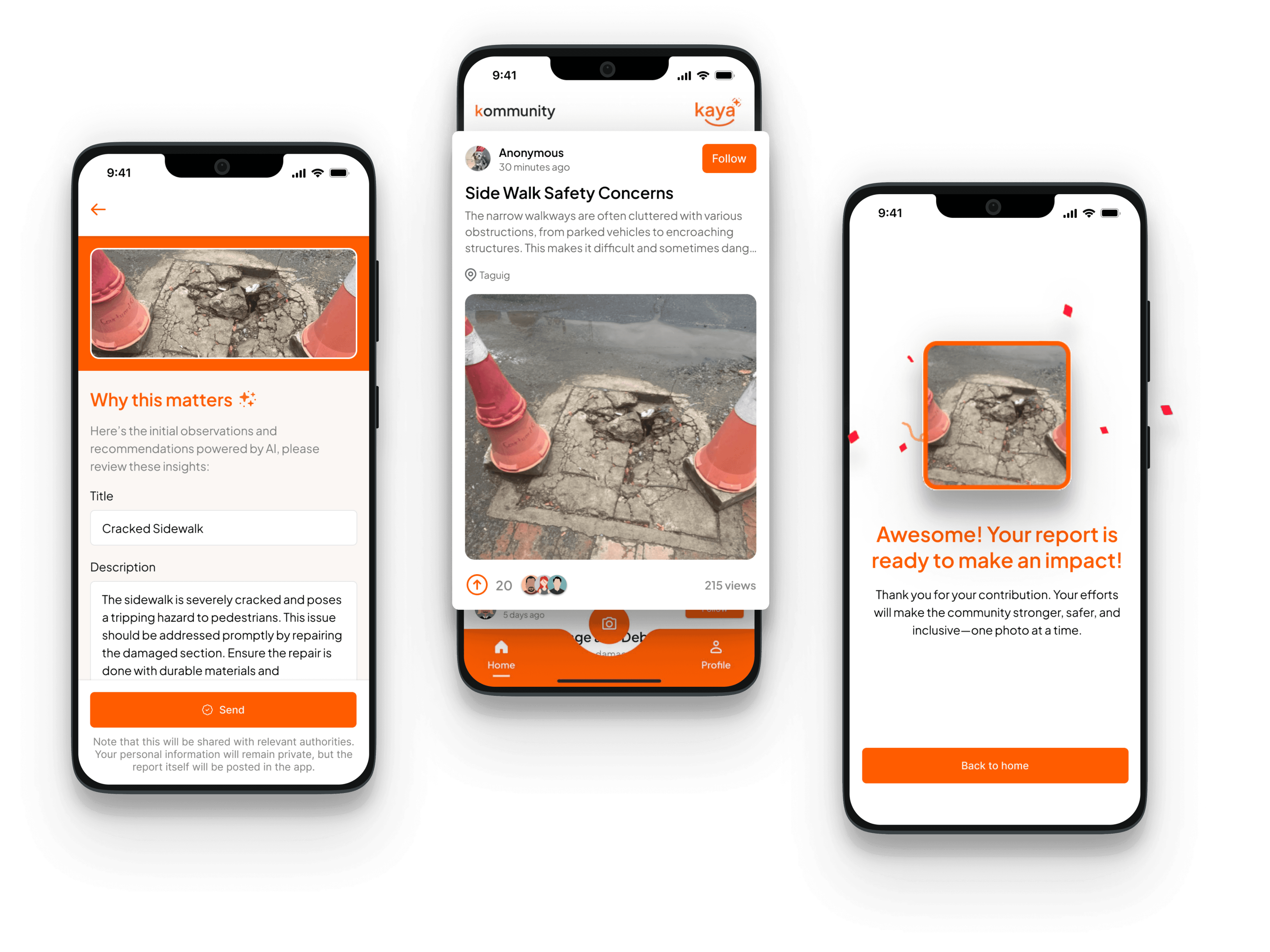
Kaya — Community-driven urban reporting app

Product Design • Mobile UI/UX • Rapid Prototyping

Conceptualized and designed an AI-powered civic reporting app that transforms infrastructure complaints into community action. Built the prototype and shipped to Google Play Store within 24 hours, winning Audience Favorite Award at FlutterFlow Hackathon.

Thanks for stopping by!

Let’s get in touch.

Say hello!

Thanks for stopping by!

Let’s get in touch.

Say hello!

Thanks for stopping by!

Let’s get in touch.

Say hello!

Thanks for stopping by!

Let’s get in touch.

Say hello!