MOBILE FIRST • SERVICE DESIGN

OVERVIEW
Redesigned a multi-platform logistics solution for Flying Tigers Express to streamline end-to-end delivery workflows. By bridging the gap between customer needs, rider logistics, and internal operations, I delivered a comprehensive digital ecosystem from concept to launch in just three months. The MVP went live in September 2024.
TIMELINE
April - June 2024
ROLE
Lead Product Designer
TOOLS
Figma, Figjam
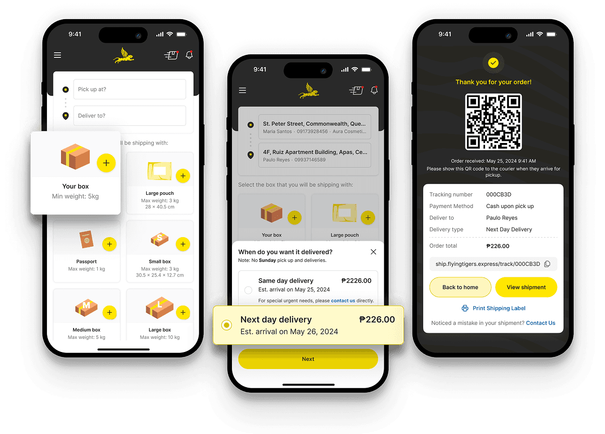
A faster, simpler way to ship across islands
Flying Tigers Express is a courier service that handles same-day and next-day deliveries across islands. Before this project, they relied on a slow web platform with long forms and a rider app that was not responsive, leading to poor usability and frequent friction for riders. I redesigned the customer, rider, and operations experience into a single, simplified system, leading to ~200% delivery growth in three months.
THE CHALLENGE
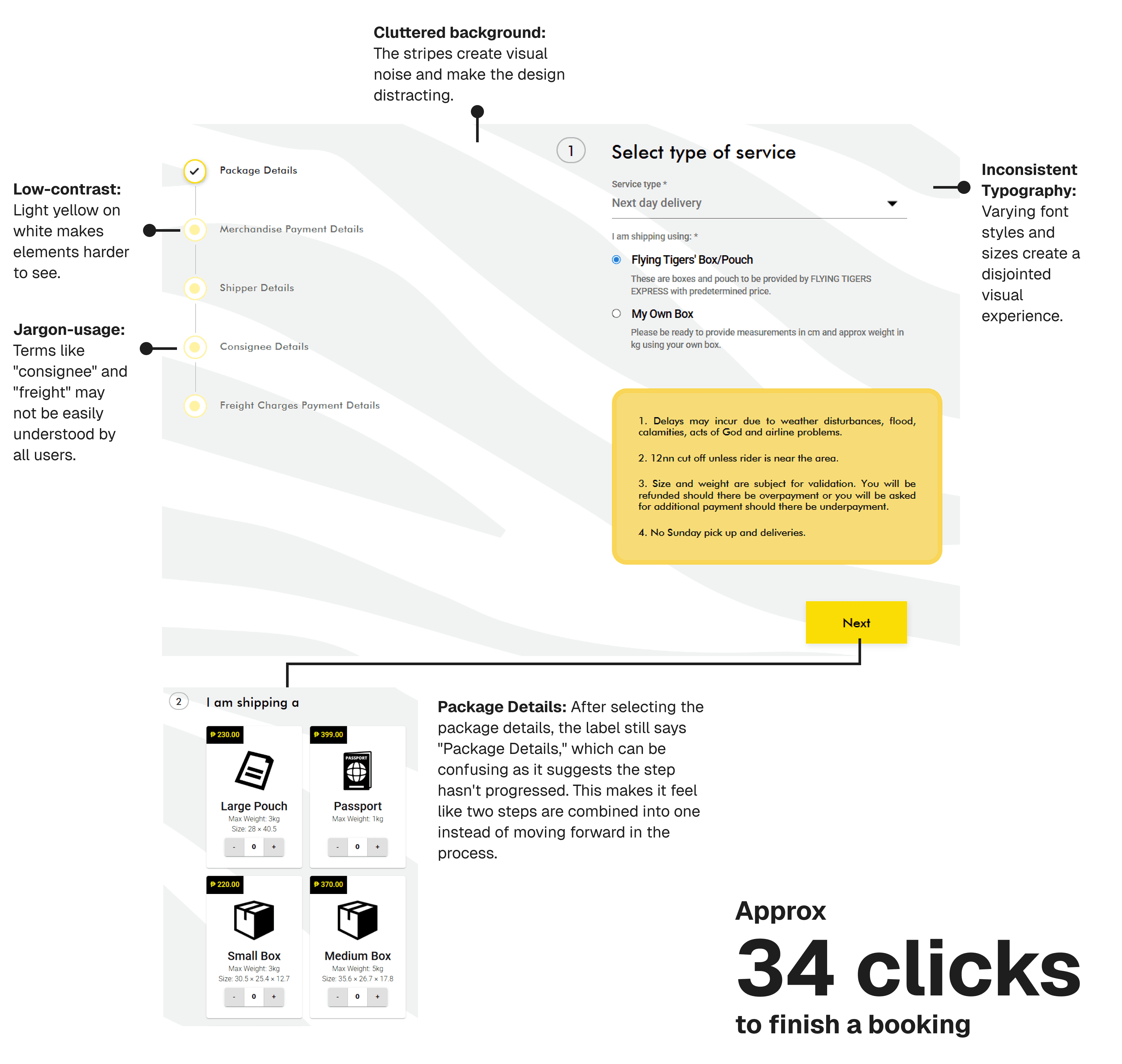
To book a delivery, customers had to fill out a long, confusing web form.
Users had to manually enter shipment details, which took longer than necessary. The interface also lacked consistency making the experience feel unpolished.
Key issues included low contrast, cluttered backgrounds, and inconsistent typography, making the experience feel unpolished.
Jargon-heavy terms and redundant steps added unnecessary friction.
The process required 10+ screens and 34 clicks, forcing users to recall previous inputs as they progressed.
No final summary made it difficult for users to review their details before completing the booking.
CONSTRAINTS & CONSIDERATIONS
Address entry considerations
At launch, map integration was unavailable during the initial build, which meant addresses had to be entered manually. This constraint shaped the interaction design.
To reduce friction, address entry was kept within a bottom sheet on the homepage. The step-by-step flow avoided full page transitions and helped preserve speed despite the lack of map-based selection.
DESIGN APPROACH
Designing a simpler booking flow
The booking experience was redesigned with a clear goal: reduce friction, shorten completion time, and prevent common errors without overwhelming users.
Instead of a single long form, the flow was broken down into a small number of focused steps, allowing users to progress quickly while staying oriented. This took shape through:
Keeping users in context: Address input was handled through an inline bottom sheet, allowing users to enter details without leaving the flow or losing progress.
Designing once, working everywhere: The booking flow was built to work seamlessly across mobile and web, ensuring consistency regardless of device.
Using language users already understand: Technical shipping terms were replaced with clearer labels like “Sender” and “Recipient” to reduce confusion and cognitive load.
Making costs explicit early: A transparent order summary showed a clear breakdown of payments before checkout, helping users make informed decisions.
Preventing errors before submission: The final step acted as a review screen, giving users space to confirm details and add notes—reducing mistakes and follow-up support.
Providing immediate reassurance: Upon completion, users received instant confirmation with a QR code for tracking and access to a shipping label, making next steps clear.

THE OUTCOME
Double the deliveries
The MVP launched in September 2024. By connecting previously fragmented systems and reducing friction across the booking flow, the impact was visible almost immediately.
~200% increase in deliveries – A simpler, more reliable booking experience enabled the team to handle roughly double their previous shipment volume without increasing operational complexity.
Faster end-to-end turnaround – Orders moved from customer booking to rider assignment significantly faster than under the previous manual workflow.
Reduced booking effort – The number of interactions required to complete a booking was reduced to 25 clicks, lowering completion time and error rates.
PROJECT SCOPE
Beyond the booking flow
While this case study focuses on the customer booking experience, the project also extended to a mobile-first rider app and an operations dashboard. Key improvements included:
Rider app: Redesigned for responsiveness, clearer status updates, and better task visibility to reduce confusion and missed deliveries.
Operations dashboard: Streamlined coordination by consolidating previously disconnected tools, improving tracking of orders and reducing manual handoffs.
These components helped address operational challenges and complement the booking experience, though only the booking flow is detailed in this case study.
UP NEXT

Kaya — Community-driven urban reporting app
Product Design • Mobile UI/UX • Rapid Prototyping
Conceptualized and designed an AI-powered civic reporting app that transforms infrastructure complaints into community action. Built the prototype and shipped to Google Play Store within 24 hours, winning Audience Favorite Award at FlutterFlow Hackathon.


Sikad — Optimized navigation for cyclists
Concept Design • Mobile UI/UX • Branding
Designed "Sikad" to help cyclists discover personalized routes and navigate with confidence.