UX AUDIT • WEBSITE REDESIGN

National Museum — Website Redesign

National Museum — Website Redesign

National Museum website mockup featuring grand interior hall, building exterior, and exhibition navigation.

OVERVIEW

I conducted a UX audit of the National Museum of the Philippines website and identified several usability issues that hindered visitor experience. Based on my findings, I created a conceptual redesign focused on delivering a more visitor-oriented experience that would improve how users plan their museum visits.

THE CHALLENGE

The existing website suffered from poor navigation, cluttered content organization, and weak visual hierarchy, making it difficult for visitors to find essential planning information like opening hours, ticket prices, and directions. Additionally, as the main homepage for all the national museums of the Philippines, the redesign needed to effectively represent and provide access to information about multiple institutions under a unified digital presence.

The existing website suffered from poor navigation, cluttered content organization, and weak visual hierarchy, making it difficult for visitors to find essential planning information like opening hours, ticket prices, and directions. Additionally, as the main homepage for all the national museums of the Philippines, the redesign needed to effectively represent and provide access to information about multiple institutions under a unified digital presence.

UX AUDIT FINDINGS

The website makes it hard for visitors to find what they need with too many menu choices and unclear navigation paths, while important information like opening hours is difficult to locate.

The website makes it hard for visitors to find what they need with too many menu choices and unclear navigation paths, while important information like opening hours is difficult to locate.

Museum website homepage displaying the "Leaves, Lace, and Legacy: The Art of Lenore RS Lim" exhibition with navigation issues annotated on the right side.
Museum website search interface with heading "Explore our collections and exhibitions" alongside annotated UX issues highlighting navigation and content organization problems.

THE SOLUTION

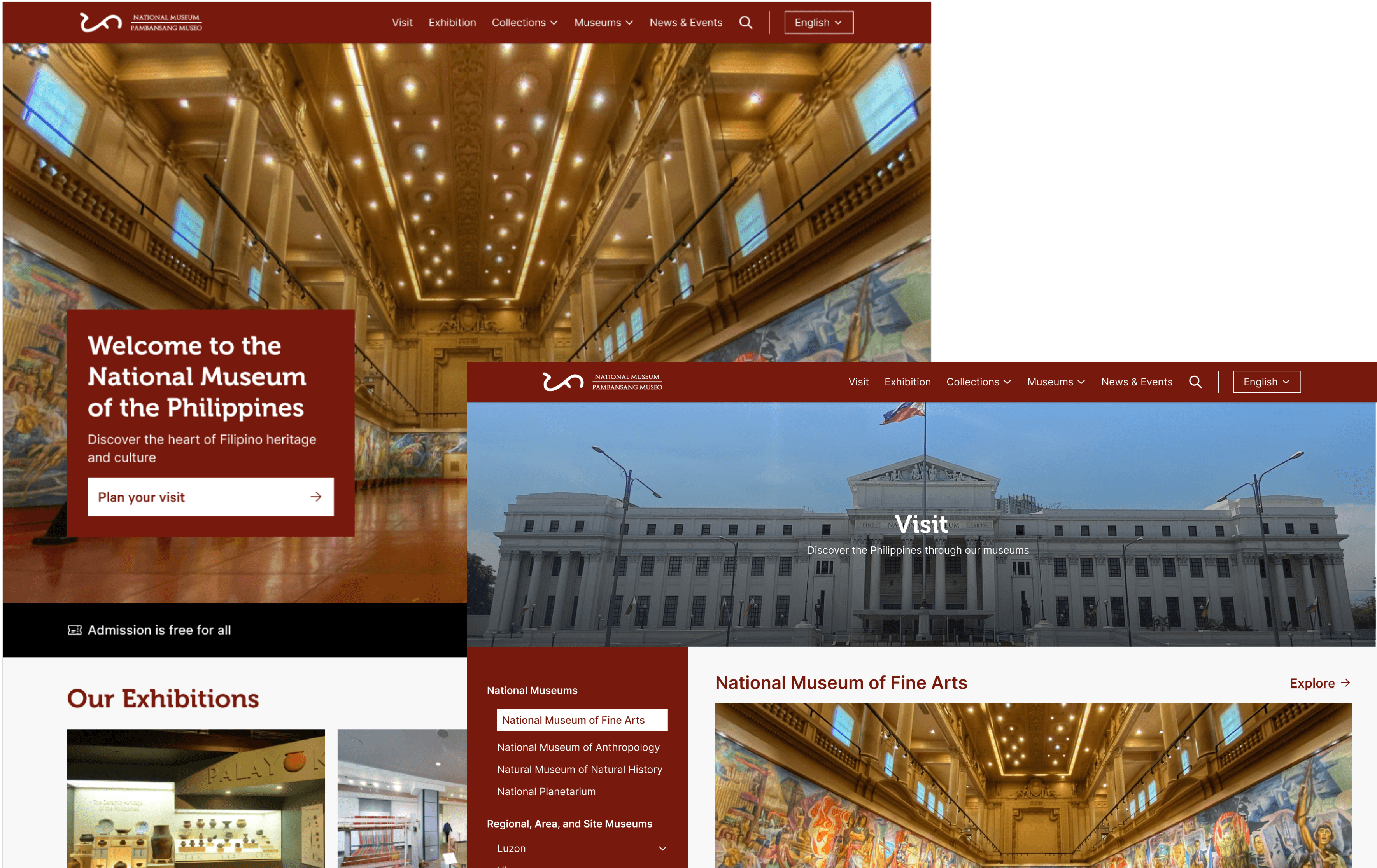
  1. Navigation & Usability Improvements 🧭

I simplified the museum's digital experience with intuitive navigation elements while emphasizing what matters most to visitors: easy access to visit planning tools and direct pathways to explore exhibitions and collections.

Redesigned National Museum of the Philippines homepage featuring improved navigation, search functionality, language options, prominent CTA, and visitor information with annotations highlighting key UX improvements.
Museum website search interface with suggested search terms displayed below the search bar and an annotation describing the improved search functionality.
  1. Content-First Museum Experience 🖼

I created a user-focused content structure that showcases both exhibitions and collections. I also made the 360° virtual tour easily accessible, maintained news and events sections, and organized comprehensive footer links for seamless navigation.

Museum website section displaying current exhibitions gallery cards and a featured collection highlighting the Spoliarium with annotations describing their functionality.
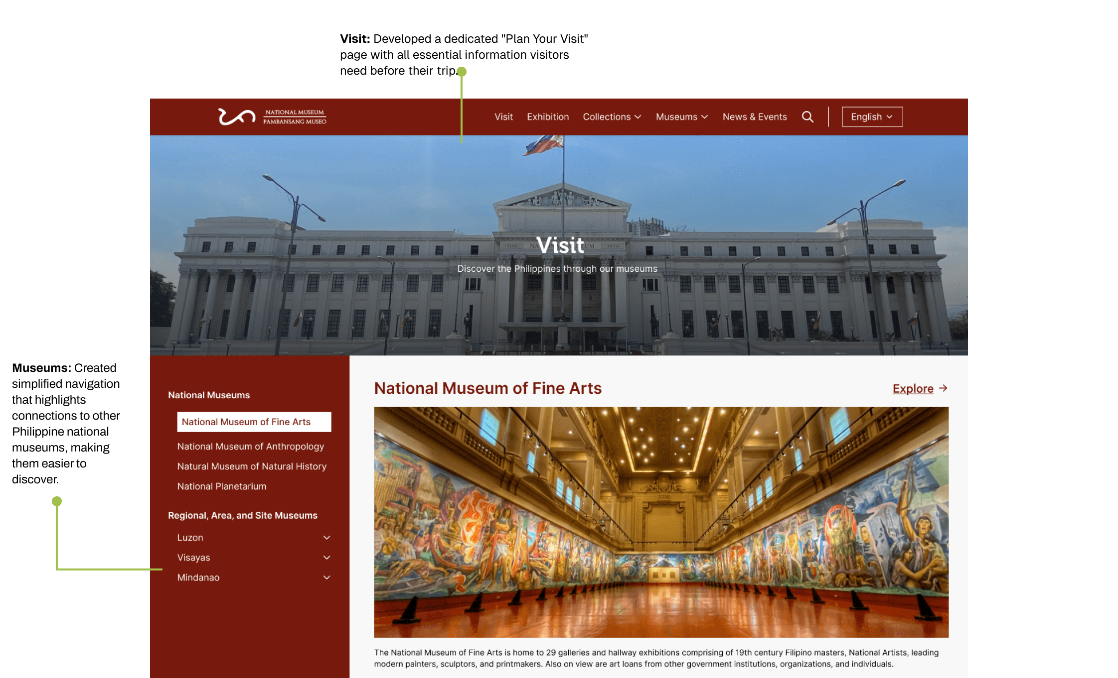
  1. Improving Museum Discovery & Visitor Experience 🖼️

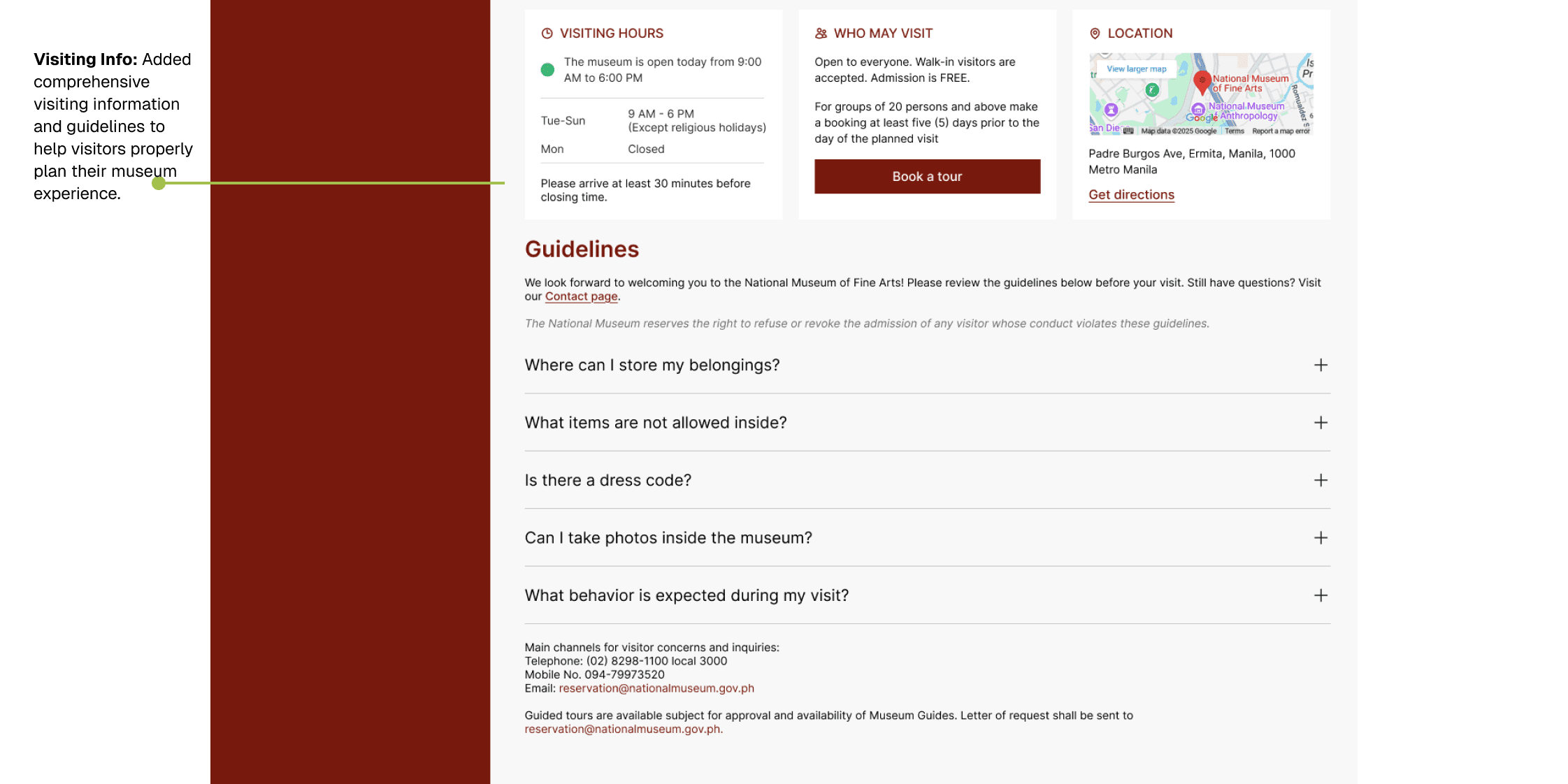
This focuses on simplifying navigation to connect visitors with all Philippine national museums while providing comprehensive visiting guidelines that ensure a well-planned and enjoyable museum experience. When visitors click "Plan Your Visit" or "Visit," they're presented with everything they need to make their museum trip seamless - from opening hours and ticket information

Museum website "Plan Your Visit" page featuring organized museum navigation sidebar and dedicated visitor information section with annotations highlighting these UX improvements.
Museum visiting information page displaying hours, admission details, location map, visitor guidelines with expandable FAQs, and an annotation describing the comprehensive visiting information feature.

KEY TAKEAWAYS

This short project taught me about what matters in designing for digital cultural spaces. Here's what stuck with me:
  1. Meet visitors where they are: Not everyone knows museum lingo - some just want to know when you're open
  2. Put the basics up front: Hours, ticket prices, and location should be immediately visible.
  3. Guide the search: Some people don't know what to search for, so provide suggestions and guidance.

  4. Create clear paths: Make it obvious how to get from "I'm interested" to "I'm planning my visit."

KADIWA grocery website mockup showing fresh produce hero section with farmer, delivery messaging, and product category navigation.

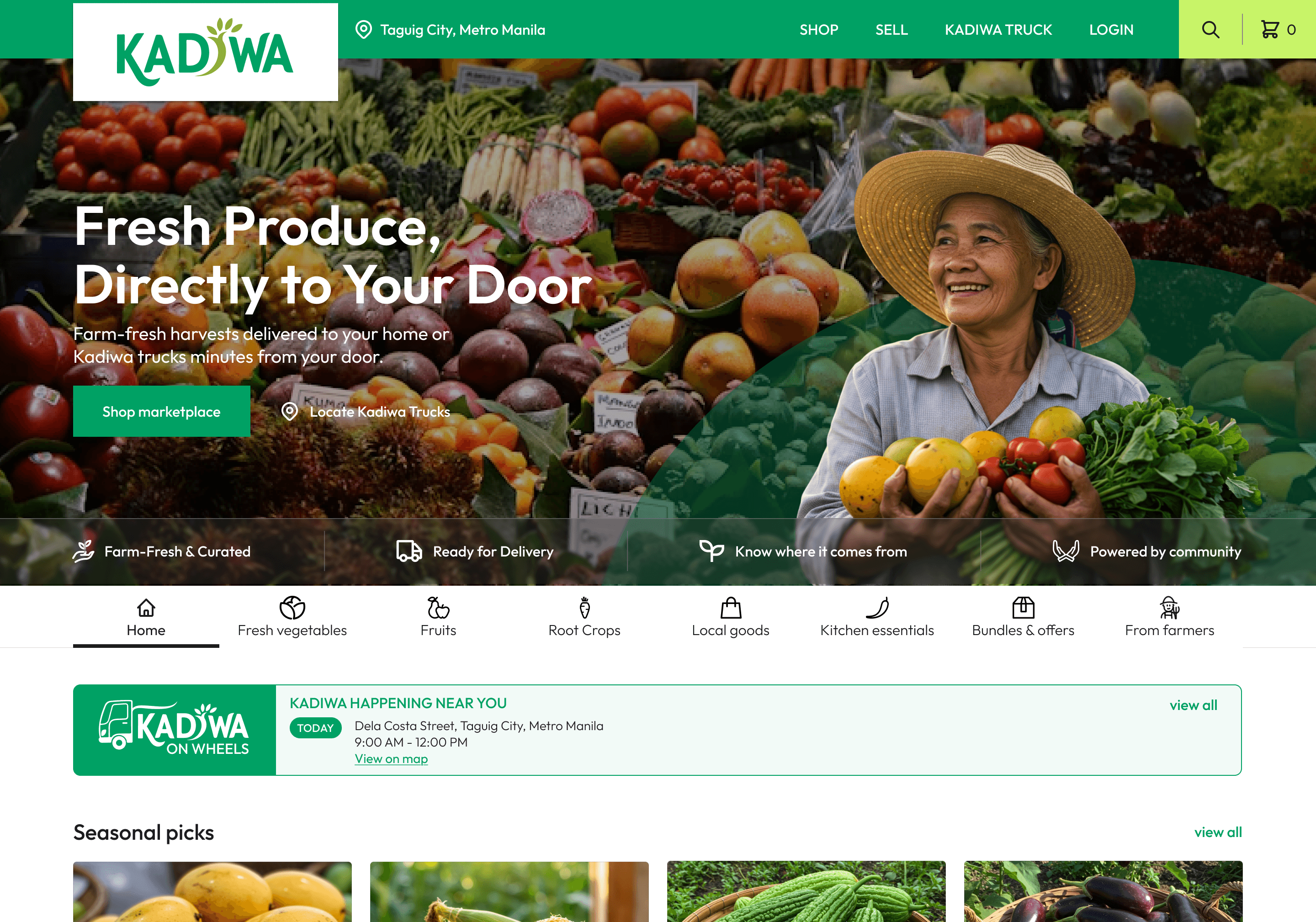
Kadiwa — Food Marketplace

Website Design  • Marketplace Design

Built a food marketplace website that connects Filipino farmers directly to urban neighborhoods, helping address food insecurity and improve access to healthy produce in cities.

Responsive dashboard design mockup showing data tables and analytics across laptop, tablet, and mobile devices

Quotal — CRM Platform

Branding • CRM  • UI Design

An all-in-one platform simplifying CRM and billing, helping businesses run efficiently

Thanks for stopping by!

Let’s get in touch.

Say hello!

Thanks for stopping by!

Let’s get in touch.

Say hello!

Thanks for stopping by!

Let’s get in touch.

Say hello!

Thanks for stopping by!

Let’s get in touch.

Say hello!